giosg
in-house / 2022- 24
sole designer in product team + working with 2 product designers on design system
giosg is a B2B SaaS platform that combines live chat, chatbots, AI, and interactive content in one platform to help you connect with your customers. I worked in a team responsible for the Reporting platform.
Context
As an in-house product designer in the Reporting team, my main task was redesign and improve the existing reporting platform. Apart from that, I was also working on DesignOps - improving product development processes like introducing user research and usability testing as well as working on giosg design system.
While the new reporting platform has yet to be released, anticipated success metrics include increased page visitors, user satisfaction scores, and reduced support team load.
UX Research: Discovering current challenges and prioritising areas to improve
Methods:
- conducted a survey to get an overview of how reporting was used at that moment
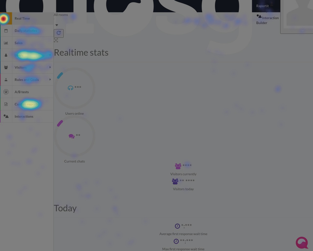
- looked at Heatmaps on HotJar & internal real-time analytics tool
- conducted detailed user interviews with selected existing clients/user
- discussed with the Customer Success team the most common questions and challenges users experienced
Overall, we saw that Reporting platform had a lot of untapped potential to bring value to the users; quantitative data from analytics tools and surveys as well as qualitative data from user interviews and discussions with CS helped us identify key areas that we need to prioritise improving.
Insights into users
Discovery allowed us to get to know our users better - overall there were two user groups:
- Managers/Leaders who want to see how their team is performing as well as gather information that they need to report to stakeholders
- Growth hackers - usually in marketing and sales, who are interested to see a detailed overview of performance and seeking to optimise and improve it
Product features I worked on
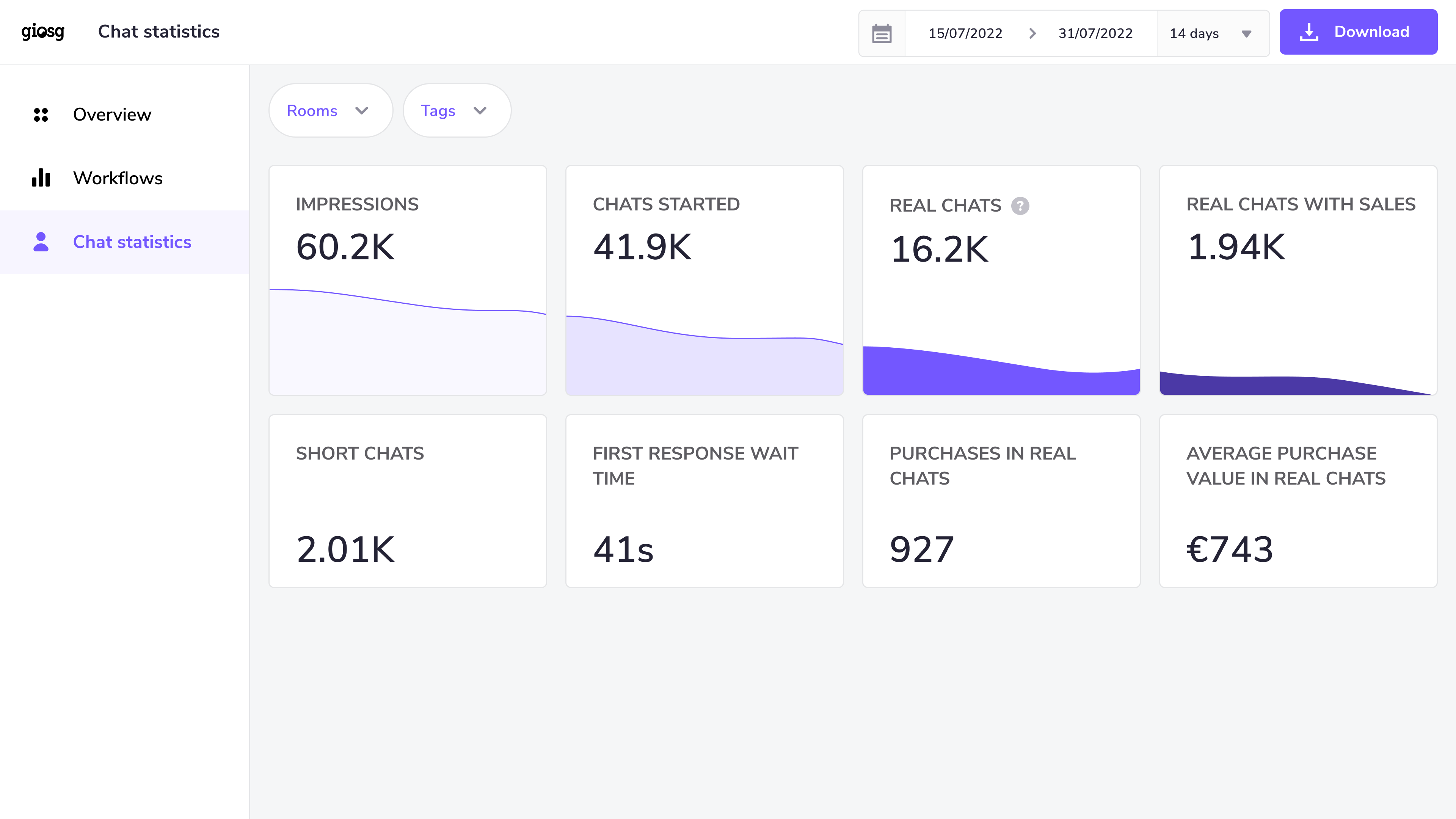
User chat statistics
According to the data we gathered this feature is one of the 3 most used on giosg reporting platform. Apart from updating & modernising the interface design, our goal with this redesign was to tell a story with data, not just show numbers on a screen.
Moreover, we wanted to reduce the noise, make information more glanceable, and show only essential information to reduce users’ cognitive load. We were showing work in progress to CS to get their input to make sure we were building the right thing.
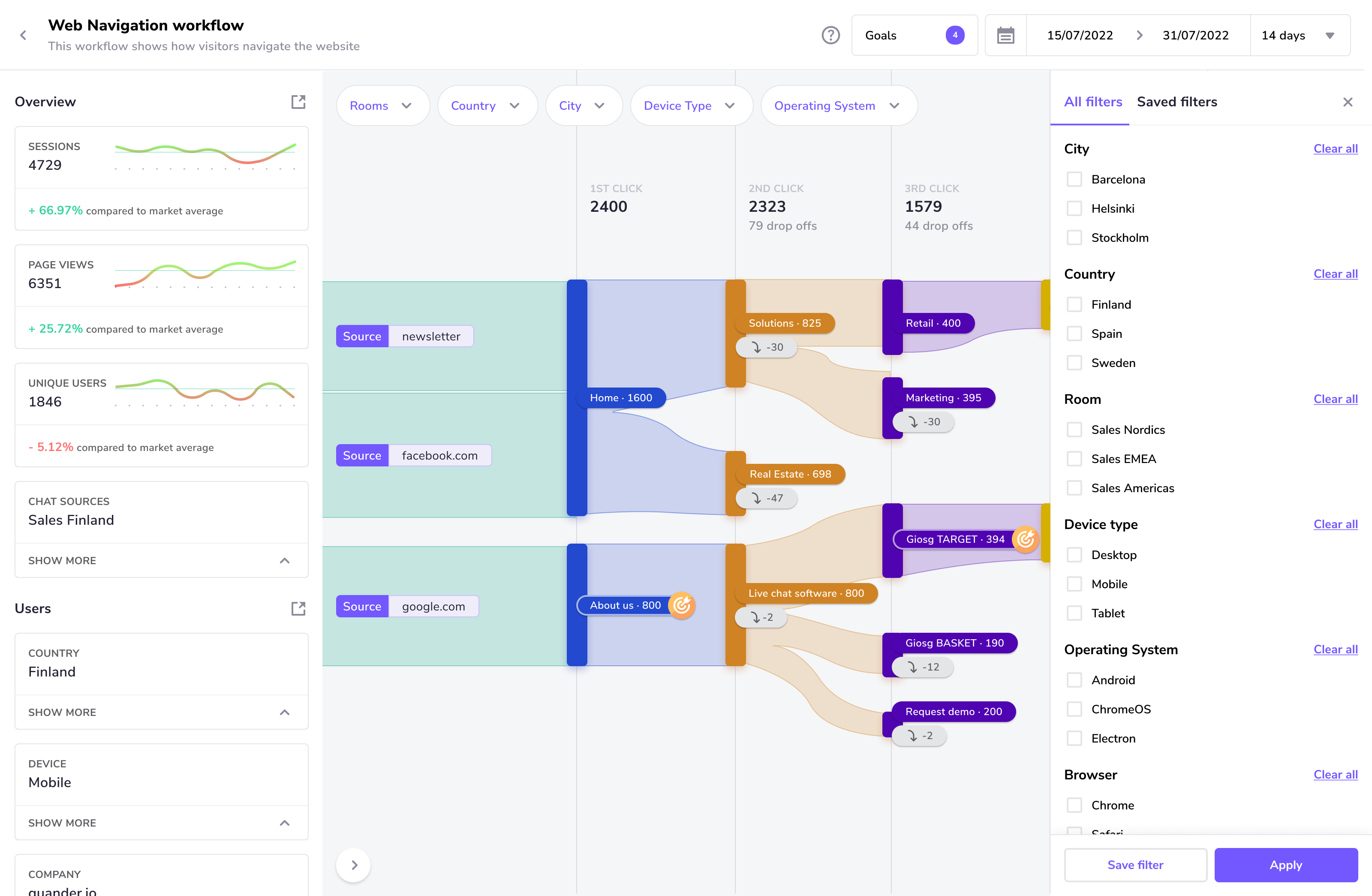
Workflow reporting
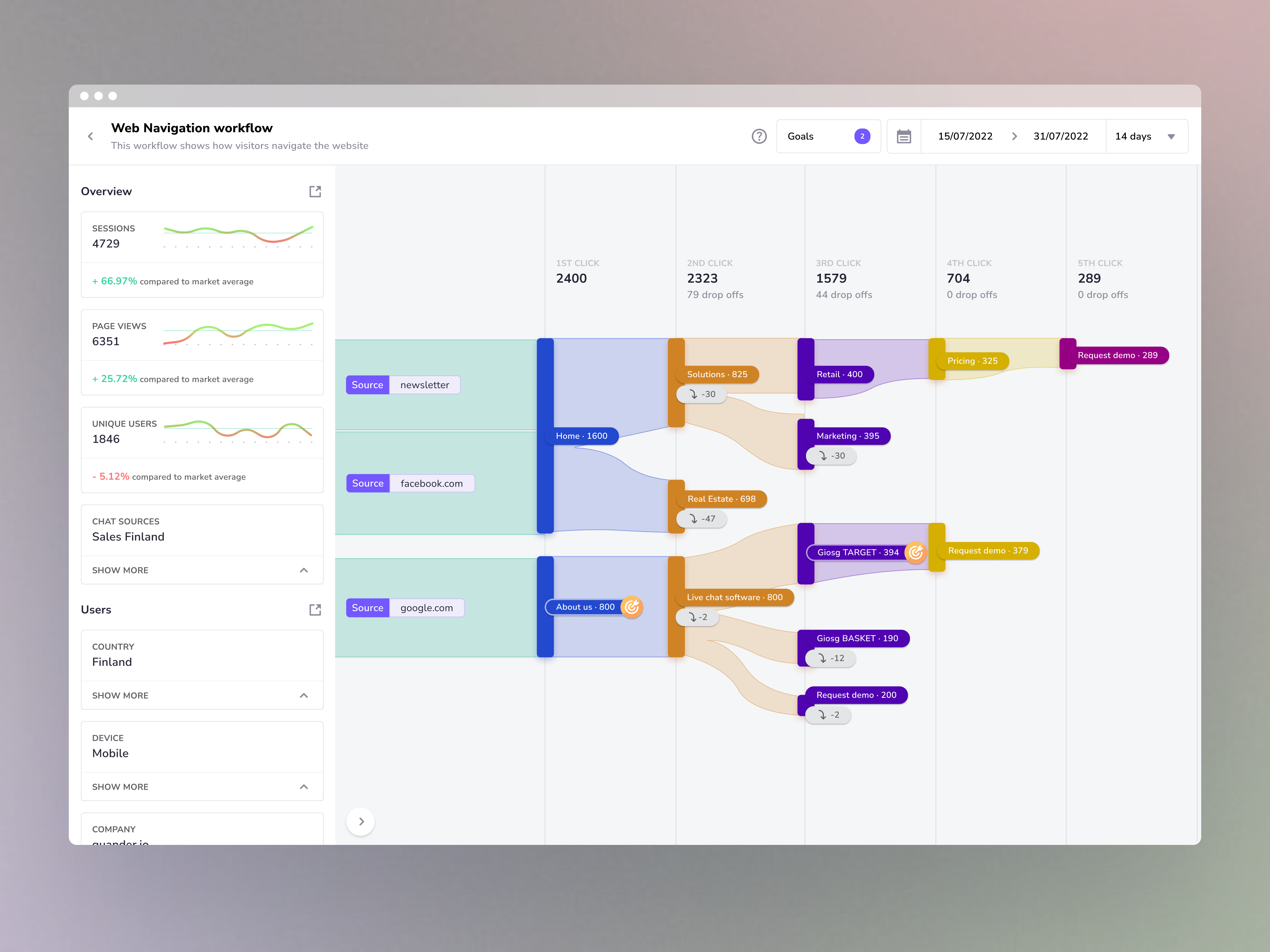
While user chat statistics provide an overview of performance, workflow reporting shows a more detailed view - it shows a visitor journey through a website or interaction (e.g. a popup made in Interaction Builder, another giosg product). Workflow reporting shows where visitors click, where they come from, and so on - providing clues for the users to optimise their websites or interactions.
Users can also set business goals like sales and leads and if they were triggered at some point on the visitor’s journey, they appear on the workflow report.
We decided to use a Sankey-like chart for this report, instead of a simple funnel, as it allowed us to show flow in greater detail, which helps our ”growth hacker” users investigate how to optimise their tactics (e.g. for marketing or sales)
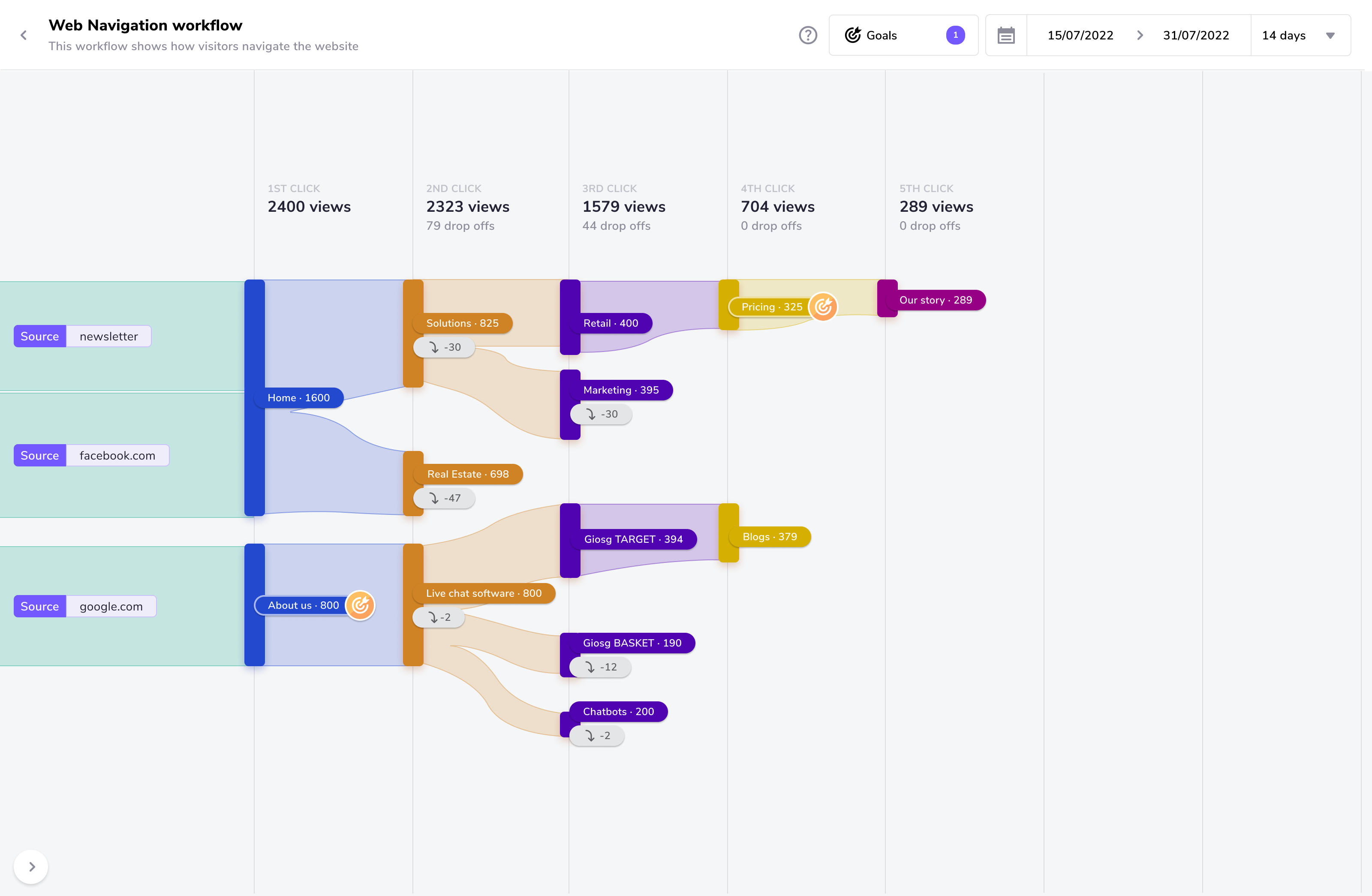
Web navigation workflow report
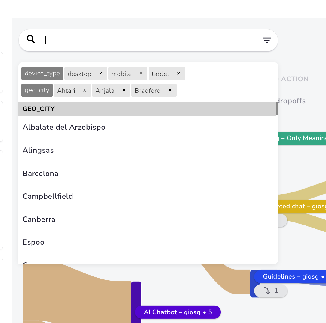
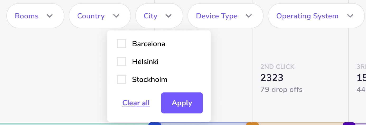
Making UX improvements for the filter components
When the first version of the filter component was released, we received a lot of feedback that it was confusing and hard to use - it caused friction and irritation. This showed that though we tried to make searching and filtering information simple by combining two features in one, in practice, when using real reports and real data, this proved to be a wrong approach.
Before
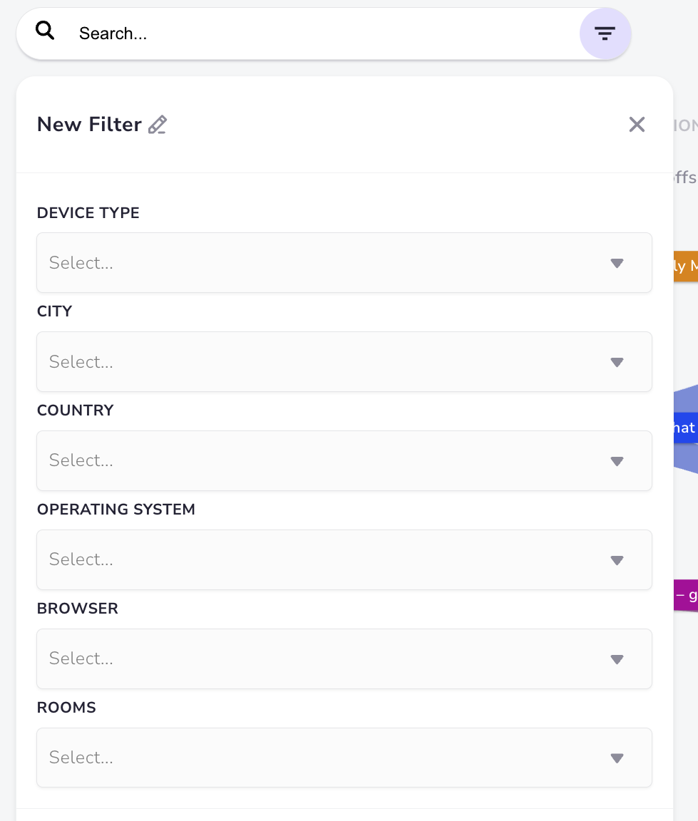
After
To solve it, we had to completely rethink the experience - we decided on the approach of showing different filter categories as chips - this way user can see most of the filter choices upfront instead of them being hidden in a window. Moreover, the switch from search autocomplete flow to simple checkboxes within a filter category allowed for a simpler and smoother experience.
Usability testing pivoted direction of design of Goals in Workflow reporting
Business goals in worklfow reporting allows users to track the key metrics and how they were achieved. When designing the flow, our hypothesis was:
When the user arrives to Workflow Report, goals should not be shown as a default. This is done to simplify workflow and make it less overwhelming. To see goals on the chart, user has to select it from a dropdown.
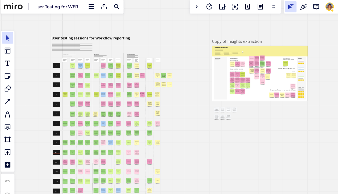
Before releasing this feature, we tested that hypothesis:
- We got 14 participants, none of them seen the workflow report before
- We crafted two scenarios (Wed navigation workflow and Interaction one) - each scenario had three tasks for user to perform. I made click-through prototypes for each scenario.
- During the testing session, we asked participants to voice their thoughts and questions as they go through the tasks. We were observing participants, did not assist them to see how easy it would be for them to complete the tasks.
- After the tasks were complete, we went through all the sessions, found common issues and questions participants had.
As a result of UX testing, our hypothesis was proved wrong and we changed the design to show goals as a default.
Designer-Developer Collaboration
Design QA
When I joined the team, we added Design QA to our product development process, which proved to be extremely efficient. It means that after my designs were implemented, developers showed me the result of their work before they released it to the customers - I double-checked that they implemented everything as intended.
Technical limitations
Throughout over 1,5 years working on the project, we made numerous changes to the concepts and design of workflow reporting. We used using existing coding framework for the sankey chart to speed up the development and it came with a lot of technical constraints. This meant that quite often when applying my designs to this framework + using real data resulted in a product that looked too busy, loaded too long, or was confusing to use. In that case, we had to revert the changes, go back to the drawing board and try a different approach.
DesignOps in giosg
Apart from my main role as a product designer in a reporting team, I also worked on designOps initiatives:
- Improving processes - bringing together designers from different disciplines to meet every two weeks to discuss each other’s work and get feedback. As a result, we were more aware of what was going on in the company and how our work might affect other people. Moreover, introducing user research and user testing helped us to make informed, evidence-based design decisions.
- Design Systems - Together with two fellow product designers, we revamped the existing design system (which was a bit outdated), introduced design tokens, audited existing designs, and improved the accessibility of colours and components in general.
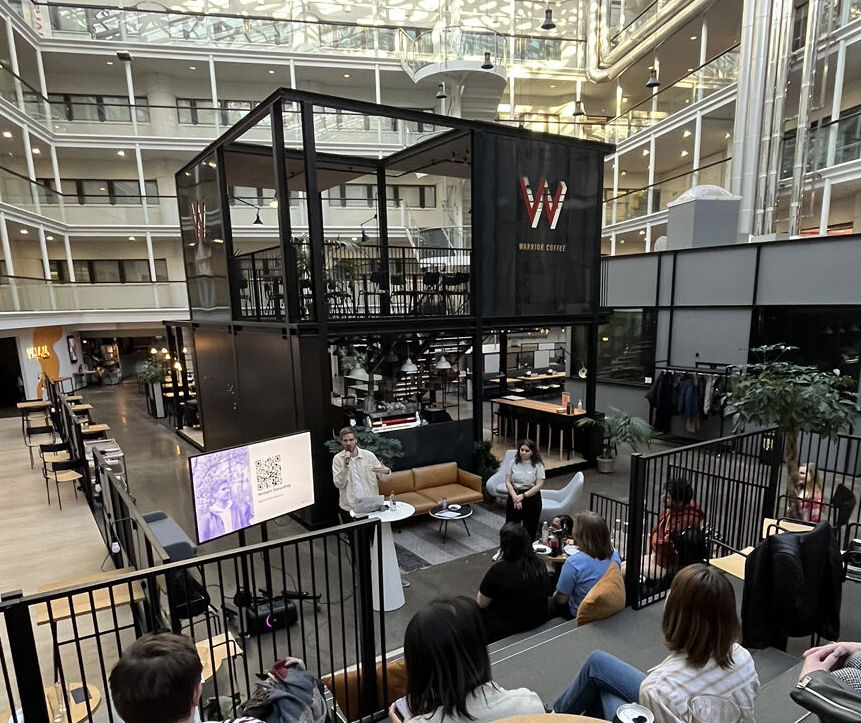
- Design Meetup - During my time in giosg I organised and hosted a design meetup, the topic of which focused on designer-developer collaboration and accessibility.
Impact
While the new reporting platform has yet to be released, anticipated success metrics include increased page visitors, user satisfaction scores, and reduced support team load.
Key learnings & Takeaways
- User research and usability testing - this was the first time I had the proper resources (time and access to users) to conduct a thorough User Research through surveys and interviews as well as plan, lead, and analyse usability testing. It was a great learning experience that equips me to conduct better discovery sessions in the future.
- Design Systems - I learned how to use Design Tokens and applied them in my work. Moreover, I had a great learning experience working on the design system for an in-house product of that scale.
- First time organising a meetup in Finland - collaborating with Helsinki Design Meetup (before I became a co-organiser of it), selecting a topic, finding speakers, managing social media presence and marketing the event, and hosting it - we had a great turnout and I had opportunity to meet wonderful designers and developers who work in the tech field in Helsinki.