MetaMinder
client work / 2021- 22 / 10 months
team of 4 designers - I focused on the app but also help to build web platform.
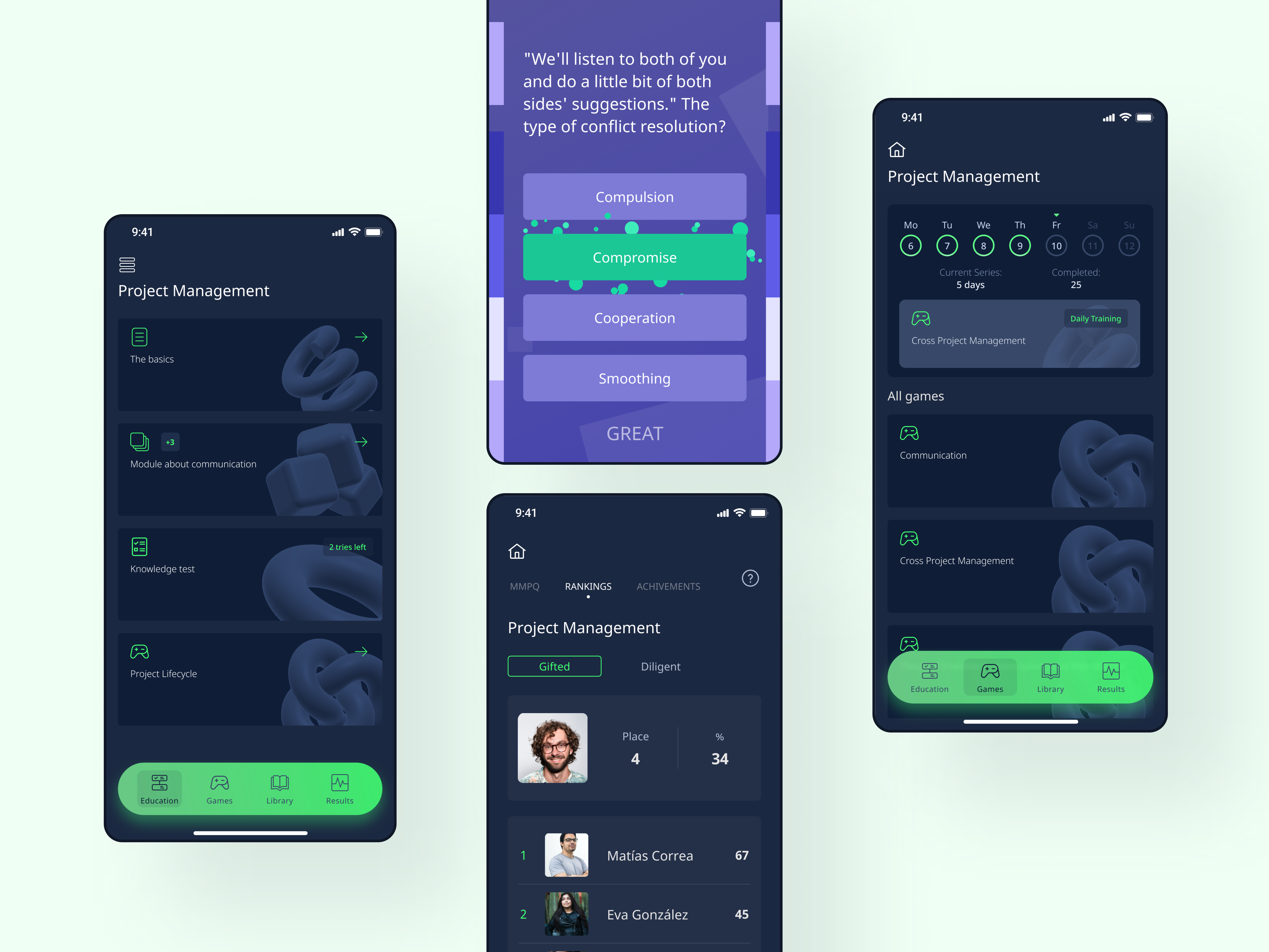
Metaminder is a Learning Management System for building and hosting online courses. It includes a web course builder, web student experience and a mobile app.
Context
I started working on the project when it was a learning app for internal training purposes. Employees all over the company used the app to get better at project management, sales and QA. I was maintaining the app, adding small new features (e.g. the option of adding images to questions in games) when I received the news that we would be building a brand new LMS / course builder and the app would be a part of that platform.
Why create new course builder & why the app needs to be be a part of it?
The company I worked at had a non-profit educational project - IT college DevEducation, that provided offline and offline courses in development, QA and project management. They were unsatisfied with the Learning Management System (LMS) they used - it had a clunky interface and a steep learning curve. Teachers and admins often struggled to perform certain tasks or were unsure about using particular features.
Thus came the idea to create our own LMS that would be straightforward to use.
In terms of having a dedicated app for our LMS - we realised that having a mobile-first platform with gamification would set us apart and give us a competitive advantage.
Conducting thorough competitive analysis to figure out what we need to build
Since we did not have solid requirements from the stakeholders, we took it upon ourselves to figure out what needed to be in the product. We conducted an in-depth competitive analysis, researched the EdTech market as a whole, and tried to identify the gaps and opportunities in the market.
Below is one of the tables we made for competitive analysis to show it to the stakeholders to get approval for the features and general information architecture of the product. As you can see, we identified the main user flows for the course-building part of the platform:
Creating a course
Filling course with content (lessons, games, tests, etc)
Previewing and publishing course
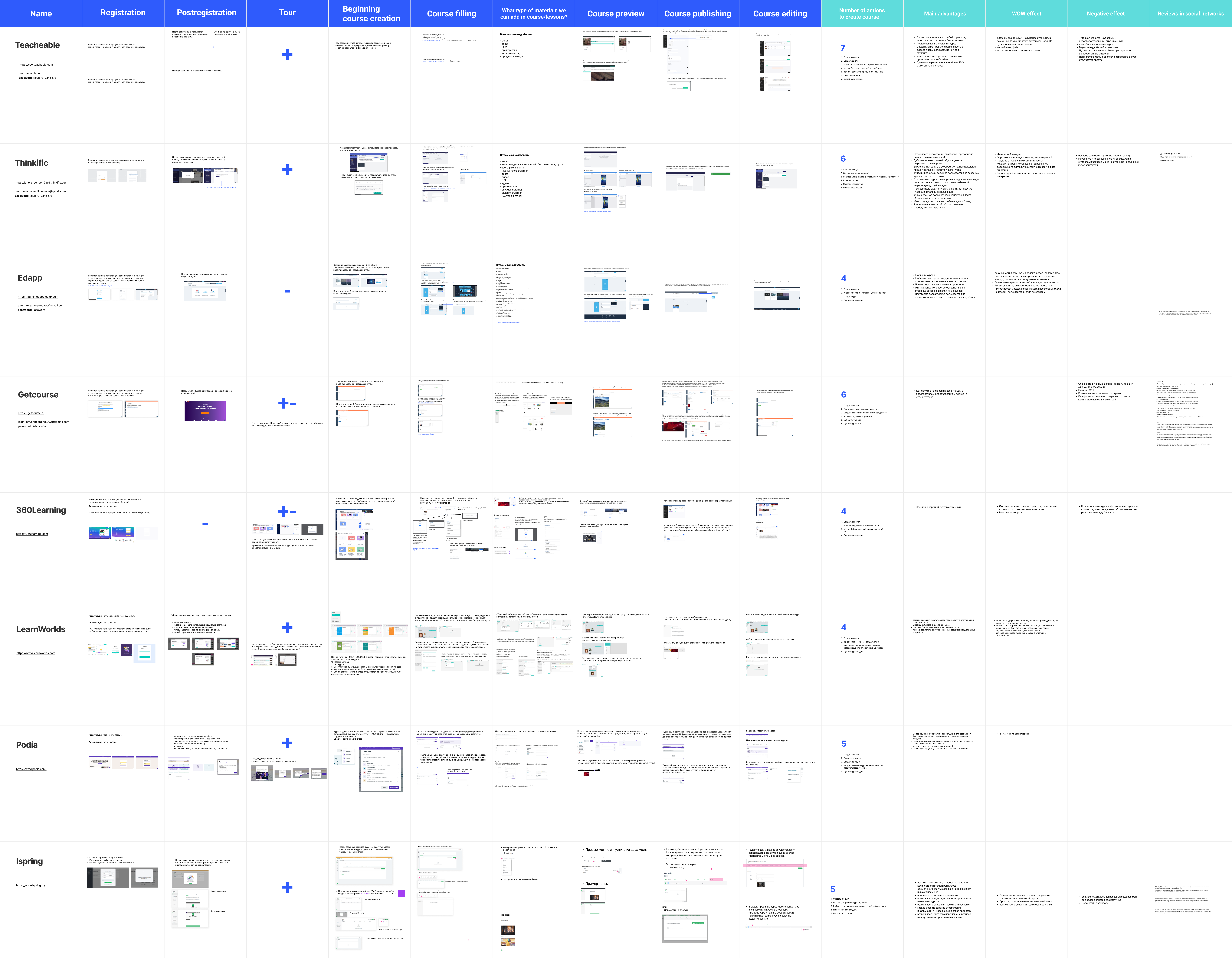
table of competitive analysis
Having decided on the core features for the web platform (both course builder and student-facing platform), my colleagues started working on wireframing and building main user flows for the MVP. Meanwhile, I was continuing to work on the app - now I had to incorporate ideas from the web into the new app.
Challenge of syncing features in web and mobile
This was one of the most challenging parts of this project. Before being a part of the ecosystem, the app had its own logic, structures and features that were already built by developers. The goal was to keep all the existing features in the app and just add features from the web to "sync" all the functionality.
However, certain features were incompatible and had conflicting logic - even though it was cheaper and quicker to keep all of the old functionality (because in that case, developers would not need to rewrite all the code), it ultimately led to poor user experience.
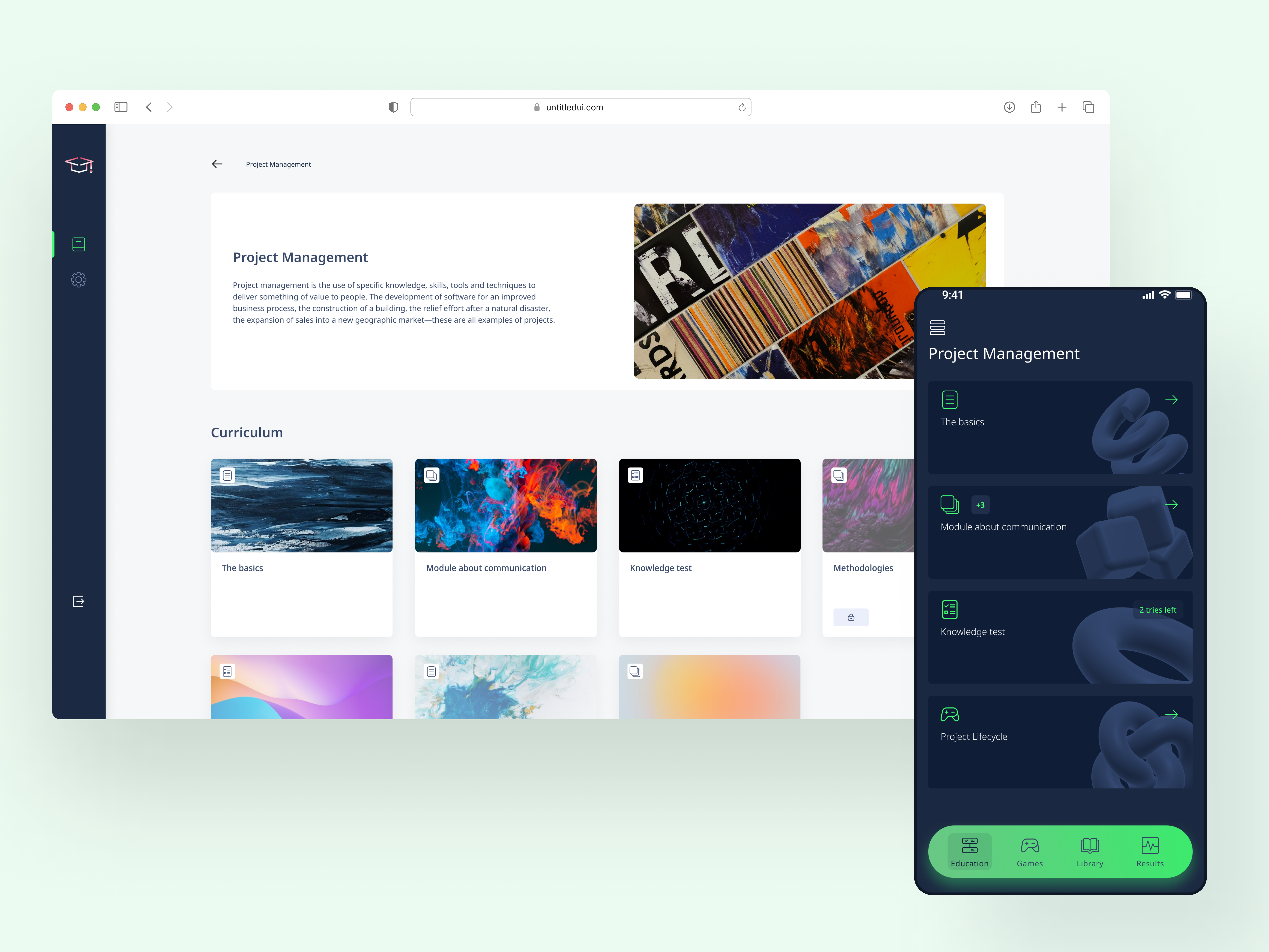
final version of the course page on web and app
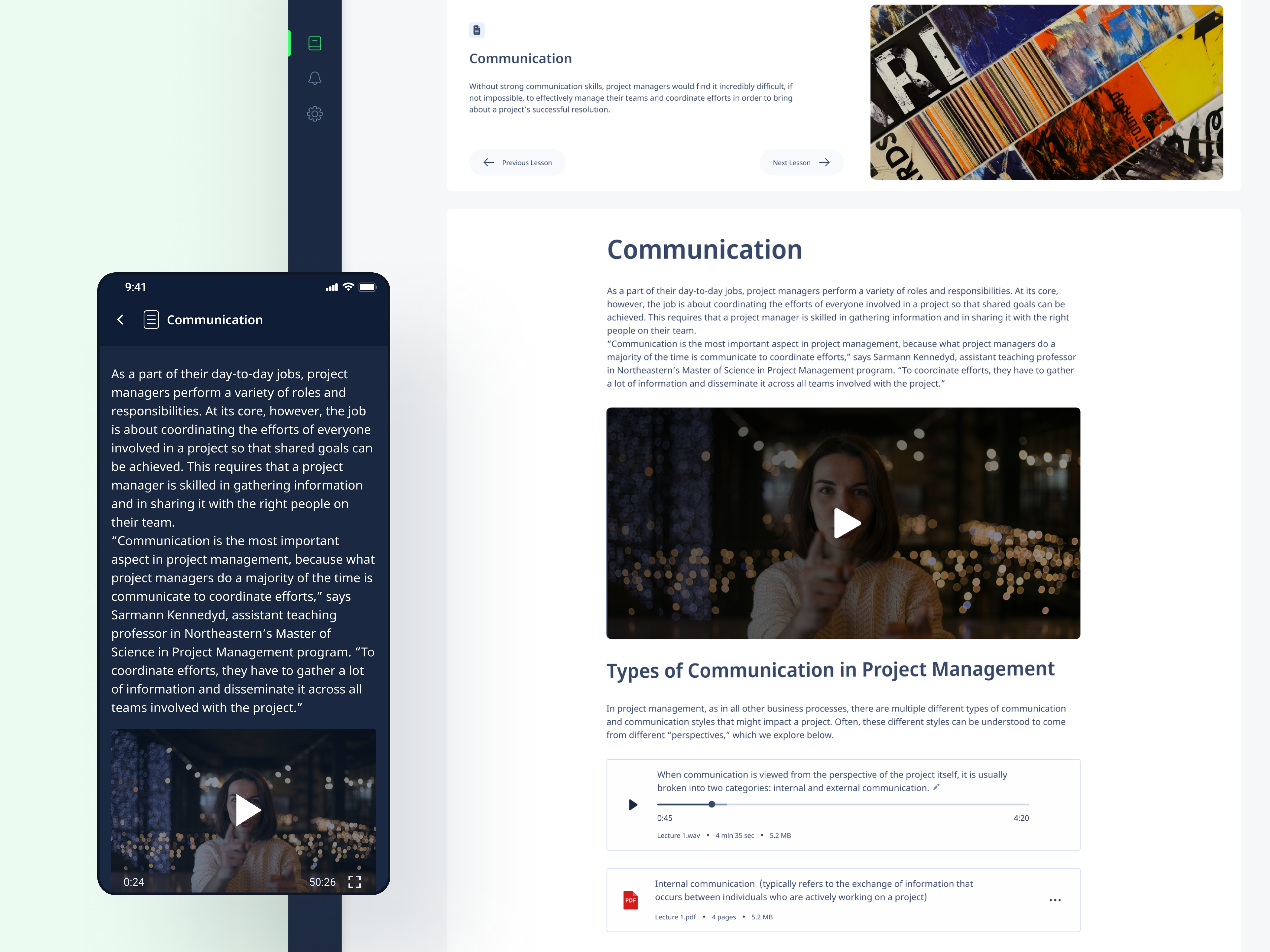
final version of the lesson page on app and web
Changing requirements & design iterations
Requirements changed every week and as a result, I had to adapt the app's design and logic.
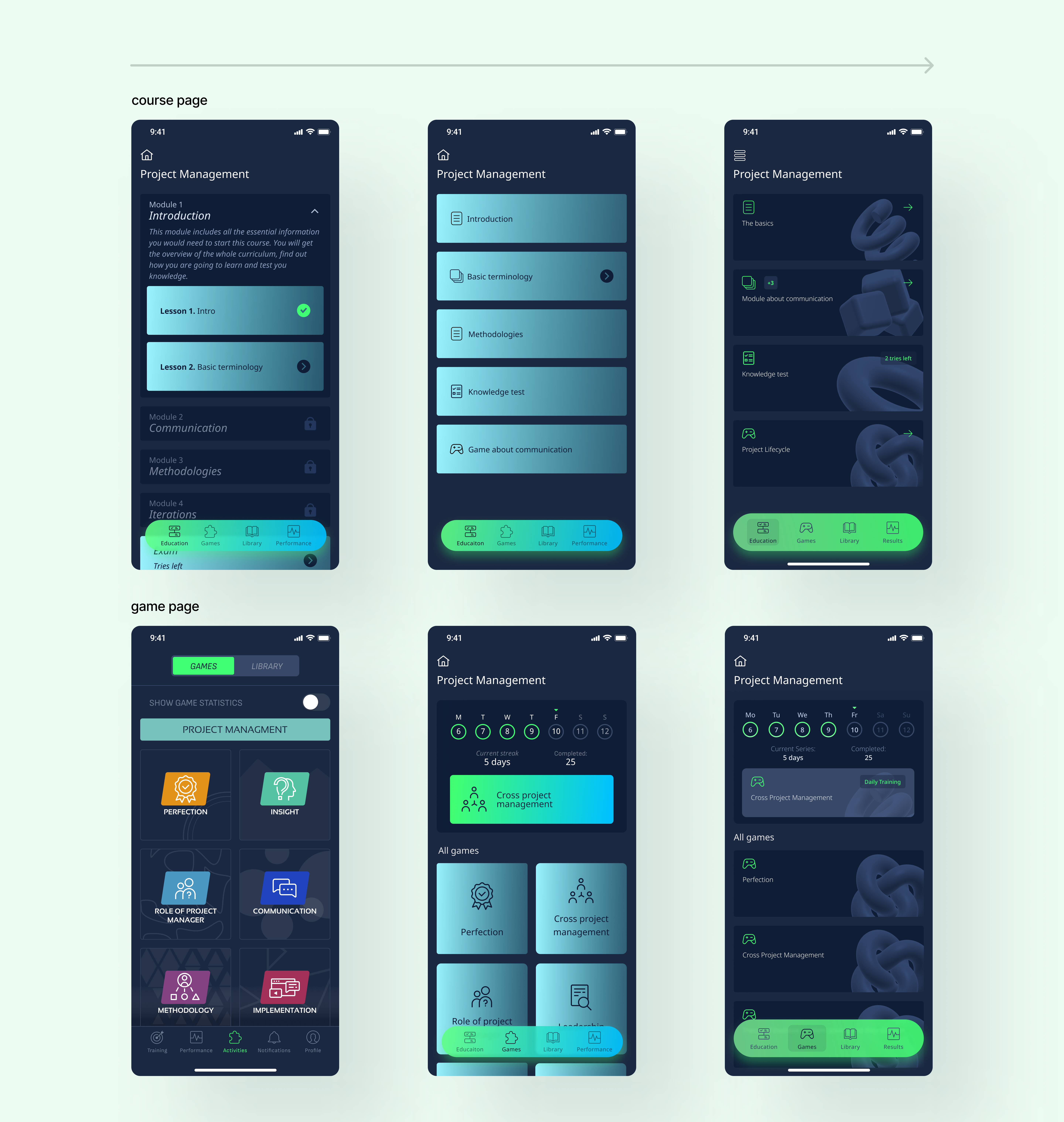
In the first iteration of the new app, the course from the web (linear chronological learning, with teachers, deadlines, homework, and learning material) was to be completely different from the app's old functionality (non-linear gamified learning - short games with rankings and achievements).
However, feedback received from the team and stakeholders showed that the structure was flawed and that the focus of the app should instead be on the main linear learning experience; games should be a "nice-to-have" feature instead of the core one.
The course structure on both web and mobile also went through several iterations, from a more rigid structure with modules with lessons and an exam at the end to a more flexible structure.
Visual identity and interface design changed as well. Below are all the iterations of the course and game page, showing the evolution of UI design.
Handoff and communication with developers
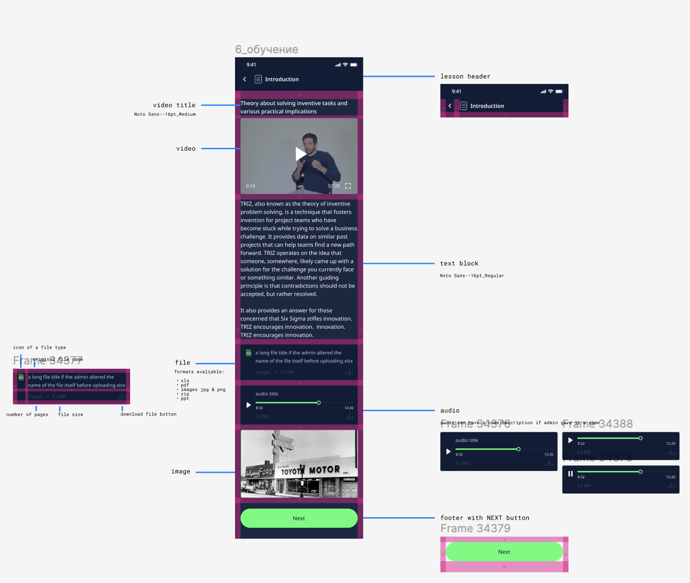
When it came to handing off the designs (the latest iteration, that is) to developers, I made sure to:
show how the designs looked on devices of different sizes and OS (IOS and Android)
include all the edge cases and scenarios (like long titles, right-to-left state for Hebrew localisation)
include specs for paddings and margins
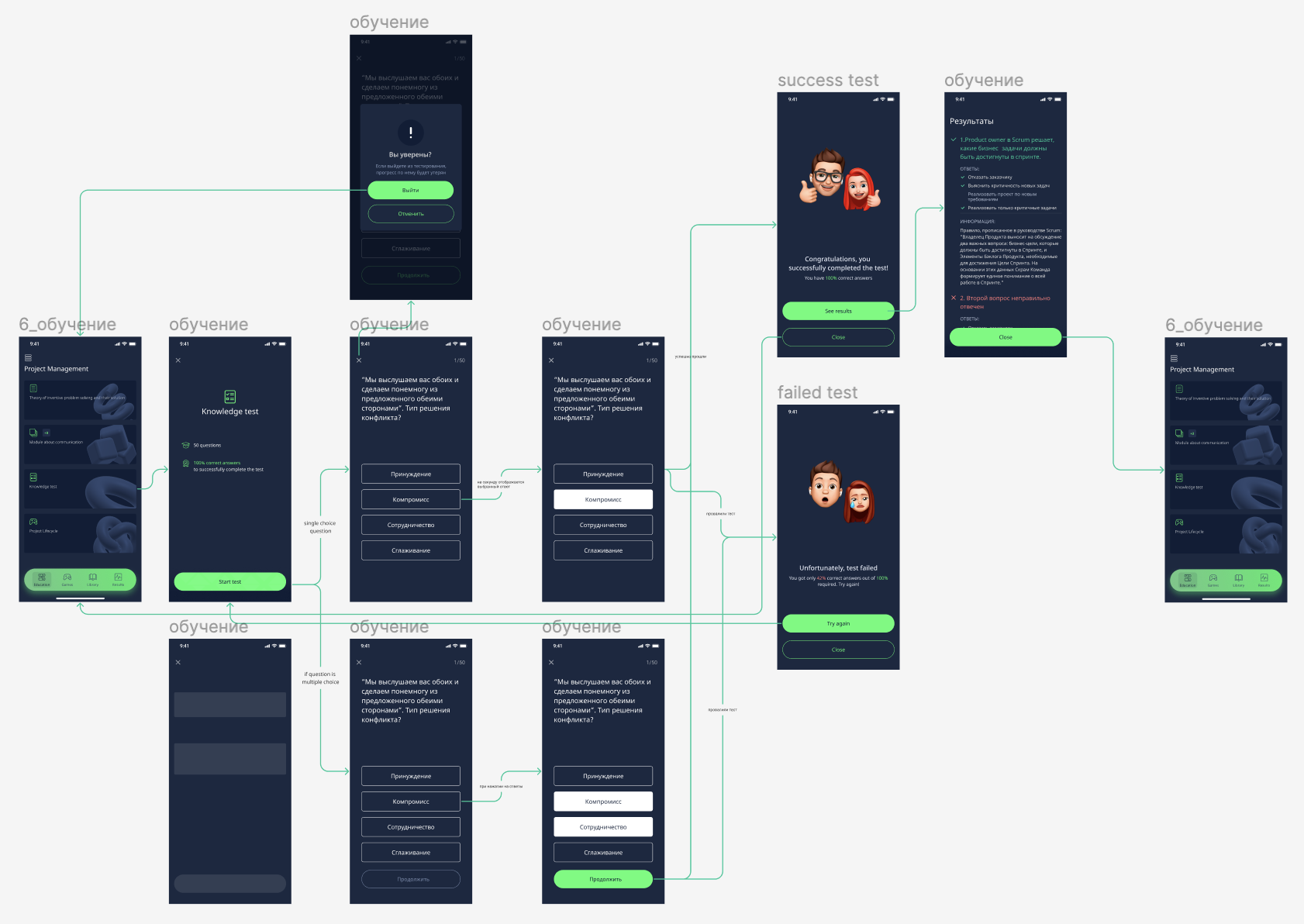
If the feature is complex, I include an annotated user flow
Key learnings & what's next
This was a challenging project because of:
Size - making sure that the user experience, features, and visual design are consistent across all components of the product.
Lack of requirements - working with barely any requirements and then endlessly (it seemed) making changes to the design logic (developers had to rewrite code as well) was mentally hard and caused burnout. If I were to start this project again, I would insist on a different creative process.
I believe that precisely because of those challenges it was a great learning experience - iterating the same features numerous times helped me practice and improve my UI design skills, while process and communication challenges motivated me to dive more into DesignOps. It was also a fantastic collaborative experience both within the design team and across disciplines, with developers and QA engineers.
As of writing (April '22) the MVP of MetaMinder is live (limited release to a selected number of users) gathering the analytics and user feedback.